COMPANY PROFILE: The secrets of that Merck rebrand
pharmafile | October 23, 2015 | Feature | Medical Communications, Sales and Marketing | Merck, branding, communications, corporate logo, reputation
Merck’s recent rebrand may have left many scratching their heads, as the company moved away from the clinical professionalism of its existing logo and into the era of the so-called ‘Vibrant M’, along with a bold (to say the least) accompanying colour palette.
Some members of the Twitter community, never the most forgiving of audiences, described the change as ‘a joke’ and ‘madness’. But Merck’s head of branding and communications, Axel Löber, insists there is a method behind it.
Clearly, the rebrand represented a significant visual change for the German-based global company, and Löber was prepared for customers to take a while to warm up to it. He says: “Our expectation was that it would be controversial inside and outside as it is a big move from where we came from. We expected a lot of discussions.
“Internally, the reaction was overwhelmingly positive. We have an internal social media service where staff can post, comment and interact, and on the first day of the new branding, we received a lot of positive reaction. It was a large step forward from the more traditional, pharma-oriented look we came from.”
It may be expected that paid staff would be receptive to the change, but what about Merck’s customers, who had long associated the company name with a clinical blue and symmetrical shapes?
In fact, when one considers pharma branding more broadly, what springs to mind is slick, professional and dependable – if sterile imagery – reflective of the strict regulatory environment within which the industry operates, as Löber recognises.
“When you look at branding in this industry, they all use the same conventions: lab coats with a high tech appearance, pharma connotations, producing things in a highly-regulated area. You really can’t show the product, so the solution is to fall back to using the production process, which makes it difficult for companies like us that are very specialised and don’t dominate the market to set ourselves apart. So we therefore made a larger step than some might have expected (with the rebrand).”
The design process
It has been a two-year journey to complete the rebrand project and roll out the new look, a process which began – ‘typically for Merck’, says Löber – with thorough research. Customers in 10 countries and in all areas of Merck’s business were consulted, and interviews with employees and group discussions helped set a baseline from which to build upon. Löber says this included asking the questions such as ‘Who are we? What is our position in the market? How do we want to be perceived?’
Merck next considered context: its brand positioning, personality and purpose, before moving to the latter-stage of the creative process of the design at the end of 2014. This stage began with the question of why a subject as exciting as science is so often sterilised with dull branding in the pharmaceutical industry.
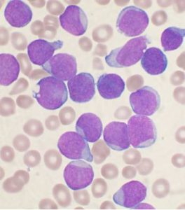
Löber says: “Science is such an exciting thing, why does it always look so dull in these blueish pictures?! We thought we needed some creative input to make the branding a little more outstanding. We wanted to have something created in isolation but which had a strong relation to our business. And what we used was the creative inspiration of the world under a microscope, something we basically do in all of our businesses, which is looking closer at basic signs, and then using them to develop technologies.
“If you had taken a microscopic picture and just used that as a logo, anybody in the market could have done the same, and we could have ended up in the same situation as we were before. So we needed to find an abstract way to use that, and we therefore introduced a very bold colour palette and certain forms and shapes, so everything you see: our logo, our font, which was developed especially for us, and all the backgrounds we now use are cell forms.
“They are sometimes a little more technical, a little bit more organic or colourful, and this was all developed from the microscopic creative starting point.”
When Merck tested the results of this process on customers in Europe and Asia, showing them only the design with no indication of a connection to Merck, Löber says the feedback received was that the branding suggested a “vibrant, young and forward-looking company that really stands out in the market.” This was, he says “exactly what we intended.”
A changing company
Merck not only wanted its new look to stand out, says Lober, but also to reflect where it is as a company today. Since its last rebrand in 2001, the business has changed and grown dramatically, picking up acquisitions like Serono in 2006 and Millipore four years later that have fundamentally altered its structure and scope.
The Merck of 2015 is no longer just a pharmaceutical company, but a global life sciences and technology giant with strong footholds in markets worldwide. As Löber explains, it wanted its brand to speak to customers about what the company is doing and creating for them.
He continues: “In healthcare in particular, we have medical devices and we are investing a lot in immuno-oncology. The problem was that our old brand did not reflect that; it first of all was driven by industry convention, so we used a lot of blueish, cold, laboratory pictures. It was a bit old school, a bit distant and not really reflective of our business today.
“But there is such energy in the company and a spirit of collaboration. We wanted to show the world that these emotions are what drive us and that we are not some distant corporate entity.”
It will likely take time for the changes to sink in and be accepted, but it is clear that they were inspired by what Merck is today, where it is going, how it perceives itself and of course, how it wishes to be viewed by the people around the world that use its products.
Löber concludes: “We wanted the new logo to stress that Merck is a very creative, vibrant company. We have a lot of business areas that make a very meaningful difference. If you look in the healthcare area, in fertility for example, we have helped to create two million babies in the world, two million moments of joy, which is an incredible and amazing story.”
Joel Levy
Related Content

Purpose and people: the enduring power of brand and the evolution of employer identity
Two decades ago, terms like purpose and people were rarely at the forefront of branding …

Merck to acquire Curon Biopharmaceutical’s B-Cell Depletion Therapy
Merck have announced that they have entered into an agreement with private biotechnology company Curon …

Merck and Daiichi Sankyo expand development and commericalisation agreement to include MK-6070
Daiichi Sankyo and Merck (known as MSD outside of the US and Canada) have announced …


