PrimeVigilance launches new brand and logo
pharmafile | September 12, 2017 | News story | Manufacturing and Production, Sales and Marketing | pharmacovigilance, primevigilance
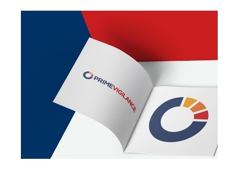
PrimeVigilance has launched its new visual identity together with a new website.
Additionally, it has begun harmonising its appearance within the Ergomed Group of companies. In reflection of itsgrowth and modernisation its new logo reflects who it is today and symbolises its dynamic future with the introduction of new brighter, more dynamic and modern colours.
PrimeVigilance’s new logo retains its core red colour and adds as a dominant colour the newly introduced Ergomed Blue, together with a few secondary colours to accent and support the primary colour palette.
The PrimeVigilance logo comprises the name PRIMEVIGILANCE in the corporate font with the ‘circle’ device. This device is derived from the Ergomed logo and represents a stylized pie chart that is associated with the presentation of the results of researches.
For any information please contact:
Florence Denance-Habek,
Head of Marketing
florence.denance.habek@primevigilance.com
Related Content

How COVID-19 has changed pharmacovigilance
The race to provide vaccines and treatments for coronavirus has seen a number of COVID-19 …

The need for evolution in pharmacovigilance
Pharmacovigilance is a critical function in ensuring public health, but is our current system built …

The March 2020 issue of Pharmafocus is available to read free online now!
The latest monthly edition of Pharmafocus, the March issue, is available to read for free …